Time to catch up with all of you again. In early April I was waylaid by rapid onset cataracts and was unable to see well enough to work in the studio or write. This lasted about 10 weeks. A long time to be away from the work! Amazingly, after my surgeries, I now see better than I ever have in my life. I need to use readers in the studio and for knitting but no longer need glasses to read or do most everything else.
When I was able to see well again, I got back to writing and editing my book and I’m so happy to say it is now finished! I had planned to self-publish using a print-on-demand company thinking I would have more creative control over the book’s design and it would be out in the world more quickly, but I found the software too restrictive and it became clear that there was going to be a lot of work on the promotion side afterwards. So, I have switched gears and am now working on a proposal for a traditional publisher. I will keep you posted on that. In the meantime, here is a mockup of the front cover I envisioned.
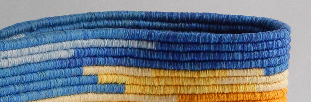
Meanwhile, I finished Coiling Chronicle 2 (CC2) in late September.

I began it on September 23rd, 2024, and finished September 26th, 2025. It measures 13.5 inches in diameter by 1.25 inches deep and has 307 sections each representing one day. The core is 4mm 3ply Zero Waste Cotton Rope by GANXXET, my go-to cordage for coiling and I used 8/2 unmercerized as well as 5/2 and 10/2 mercerized cotton yarns. I shared posts about the process for CC2 HERE and HERE and HERE.
There is a longer gray section in this chronicle which marks the weeks I couldn’t see well enough to work.
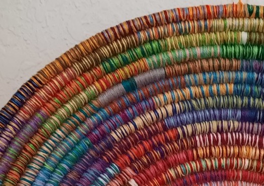
I spent a lot of time fussing about the 12 base colors for CC2 trying to get to the “right” 12 colors, evenly spaced around the spectrum. About six months ago, I ran across an article by Susan Z Douglas in SpinOff magazine[i] which referenced David Hornung’s book, Color: A workshop for artists & designers[ii] and his concept of co-primaries. According to Hornung, there are no “true” primaries, every red skews either toward orange or purple, every blue toward green or purple etc. I’m not sure that I agree with him about this, but it’s an interesting idea. When I returned to work on CC2, I started thinking about what I wanted to do for the next chronicle. I wanted to do something similar with CC3, using 12 colors as a base but didn’t want to use the same 12 colors. Thinking about co-primaries and all the time I spent trying to match the traditional colors of the color wheel for CC2, I decided that for my next chronicle I wanted to choose colors that fit together while representing a range of colors across the spectrum. Here are the colors I chose:
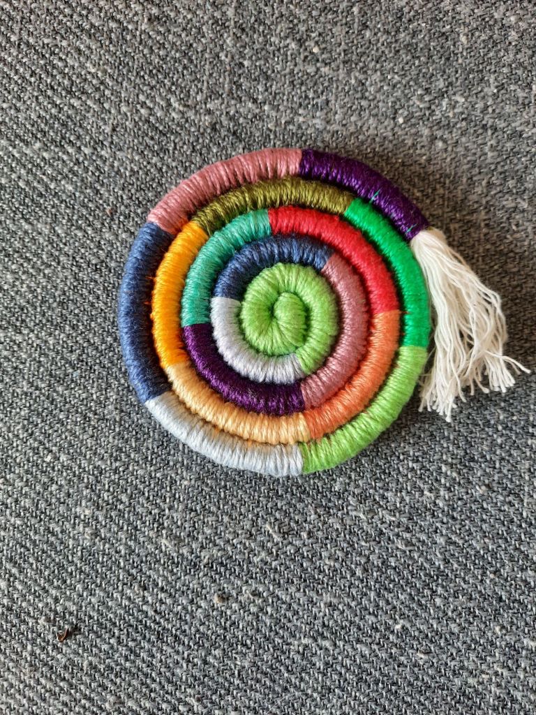
I also decided I wanted to narrow the parameters for the colors even further. Each month has an assigned color but I’m only using the 12 chosen colors in this chronicle. Looking at CC1, I see a wide range of colors and values. An amazing range of feeling in the colors. In CC2, the monthly base colors give a more even feel to the piece, even though there is still a lot of variety. In CC3, I want to narrow the range further, pull in to create a more unified sense for the year, even while having unique color combinations for each day within the month.
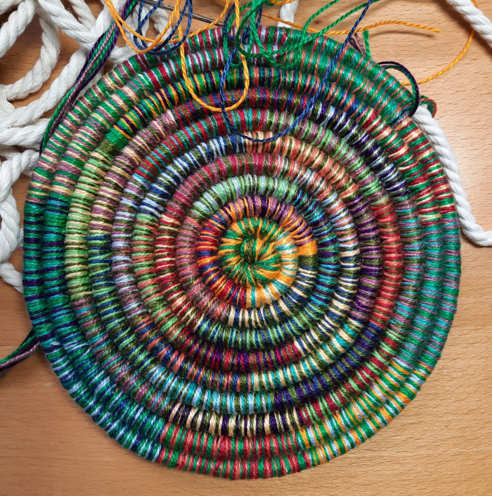
To further restrict (complicate?) things, I’m also not using the color on either side of each month’s color during that month. For example, October’s color is a midrange mossy green. Next to it are the yellow/gold for September and the blueish green I am using in November. This leaves 9 colors to use in combinations of 2 for the other colors in each strand. Will this give me enough variety not to repeat myself in one month? Yes, it will. I actually did the math to check that.[iii]
I thought I’d be able to track the color combinations just as easily in the chronicle as I did in the other two without having any repeats. Unfortunately, I discovered about 2/3 of the way through October I already had two duplications. Sigh…. I used a grid on some graph paper to note which colors I had used so far for October and found the duplications and decided this would be a good way to track the colors while I was working to avoid future duplications.[iv]

I like the way the colors are blending so far in this new chronicle.
I hope you have been spending some time creatively these days. I know it’s hard sometimes, but it’s also so important! Joy in Color to you.
[i] Douglas, Susan Z “Slipped-Color Exploration”, SpinOff magazine Spring 2023, (pp 32-35), SpinOffMagazine.com. Douglas, Susan Z “Small Change Scarf”, SpinOff magazine Winter 2024, (p 96), SpinOffMagazine.com. Both of these articles are available on Douglas’ Ravelry page, https://www.ravelry.com/designers/susan-z-douglas
[ii] Hornung, David Color: A workshop for artists & designers 2020, 3rd ed., London: Laurence King Publishing
[iii] I didn’t use an equation to figure this out—much to my husband’s continued dismay, I don’t like math and use it as little as possible. Looking for unique two-color combinations using nine colors, there are 8 combinations of color 1 plus all the remaining 8 colors. Since color 1 and 2 have already been combined, the remaining combinations for color 2 equal 7 and so on. So, there are 8 combinations for color 1, 7 for 2, 6 for 3, 5 for 4, 4 for 5, 3 for 6, 2 for 7 and 1 for 8. 8 plus 7 plus 6 plus 5 plus 4 plus 3 plus 2 plus 1 equals 36 giving me enough unique combinations for each month with a few to spare.
[iv] I set up the grid with the 9 colors for the month in a column as well as a row across the top. Each morning when I choose the 2 additional colors for that day, I mark the colors in both the row and column. The circles on the grid mark where each color crosses itself. If any of you have an idea for a better system, please let me know!

L
LikeLike
Just reading this now. So happy that your cataract surgery went well and you have your vision back! Your chronicle basket is lovely!!
LikeLike
Thanks so much, Valerie!
LikeLike